What is responsive design?
Updated · By Robert Breen
Responsive design means a web page rearranges itself to fit whatever screen it is opened on: wide layouts on a desktop, a single stacked column on a phone, with text and buttons still easy to read and tap. Most AI app builders produce responsive pages when asked.
Why it matters for a small business
Customers often reach out from wherever the problem is, and that usually means a phone. Someone standing in a flooded basement or a hot house isn't going to find a laptop. If your request form is tiny, needs zooming or hides the submit button off-screen, they give up and call a competitor.
Responsive design used to be a job for a web developer. With an AI app builder, it's a sentence in your prompt, but it still needs checking. A layout that looks great in the builder's desktop preview can squeeze fields together on a narrow screen. Testing on an actual phone takes a minute and catches most problems.
In a real lesson: Build an AI Emergency Request Form for Your Plumbing Company
In the AI Emergency Request Form lesson, you build a "Need a Plumber?" form for Blue Maple Plumbing, a made-up plumbing company, with Name, Email, "What's the problem?" and Service address. Alongside the fields, the prompt you paste into Lovable includes the line "Make it responsive for desktop and mobile."
It fits the job. The form exists for problems like a burst pipe, where the agent marks the request as an emergency and emails shutoff steps. People in that situation are on their phones. The same prompt keeps the page lean, with no navigation, pricing or testimonials, which also helps on a small screen.
Every Lovable lesson in the course includes the same responsive line, from the Cedar Ridge Heating & Air service form to the Harbor & Pine coffee signup page.
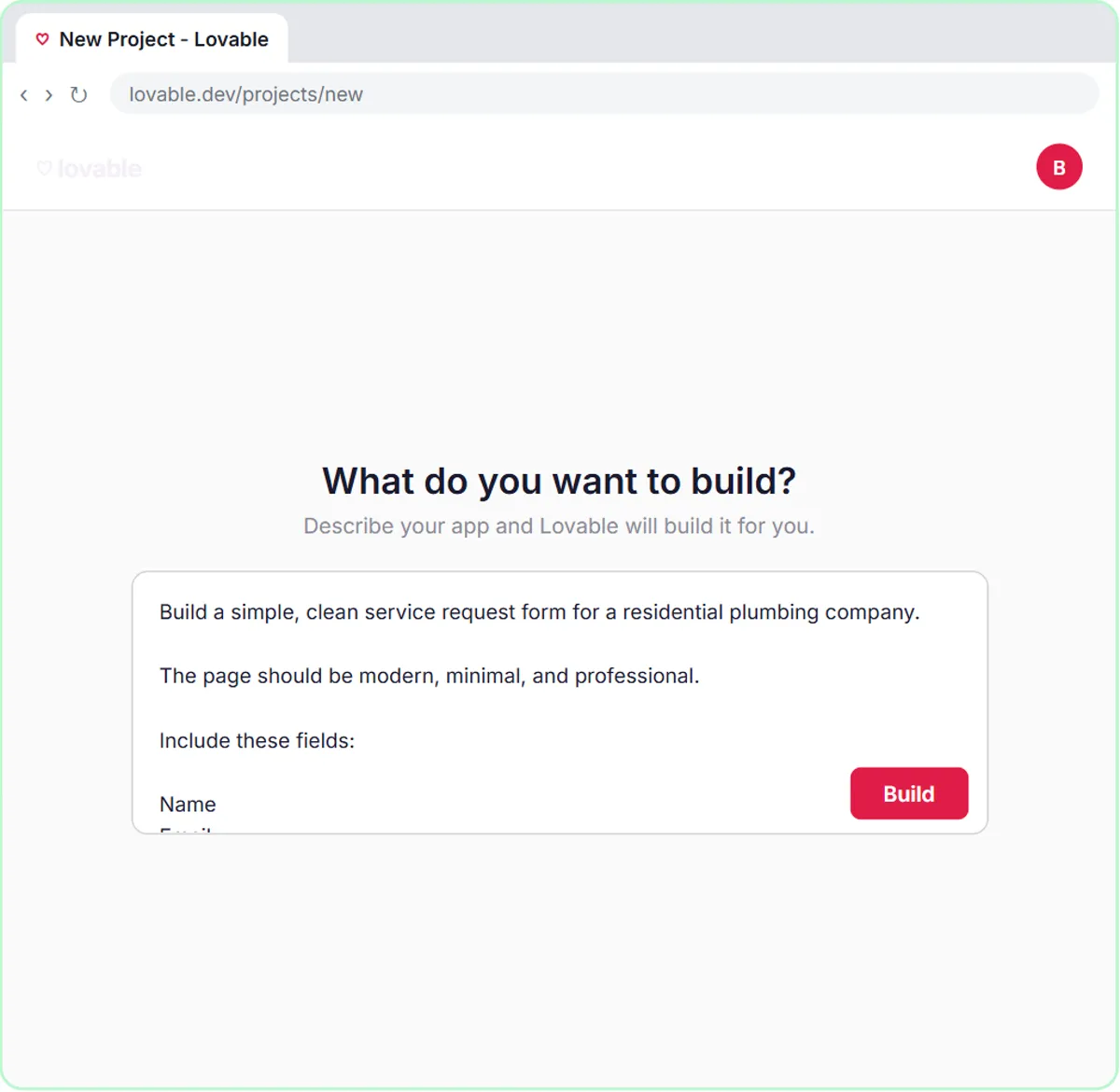
Try this lesson free or read the step-by-step guide.
Common confusions
Responsive site vs mobile app
A responsive site is a web page that adapts to phones in the browser. A mobile app is installed from an app store. For a request form, a responsive page is almost always enough.
Responsive vs fast
A page can fit the screen and still load slowly. Keep forms simple, with few images, so they're quick on mobile data too.
Tips
- Put "Make it responsive for desktop and mobile" in every app-builder prompt.
- Open the published page on your own phone and submit a test.
- Check that the submit button and any error messages are visible without zooming.
Related terms
Where you use it: free lessons
- Build an AI Emergency Request Form for Your Plumbing Company (Lovable and n8n, 15 min)
- Lovable + n8n: Build a Web App with an AI Backend (Lovable and n8n, 15 min)
- Build an AI Service Request Form for Your HVAC Company (Lovable and n8n, 15 min)
More free tutorials
Frequently asked questions
- How do I make a Lovable app mobile-friendly?
- Ask for it in the prompt, such as "Make it responsive for desktop and mobile", then open the app on a phone and fix anything that looks cramped by asking Lovable for specific changes.
- Does responsive design matter for a simple form?
- Yes. Forms are where small layout problems stop people from finishing. A field or button that's hard to tap on a phone costs you requests.