What is a pivot table in Google Sheets or Excel?
Quick answer
A pivot table is a spreadsheet tool that summarizes a long list of rows into a compact table of totals, counts or averages grouped by the values in a column, such as total spending per category or per vendor. You build it by choosing fields, not by writing formulas.
Last updated
Updated · By Robert Breen
Why it matters for a small business
Lists grow fast. A sheet with hundreds of expenses, leads or tickets is hard to read row by row, but most questions about it are simple: how much per category, how many per month, which vendor costs the most. A pivot table answers those in a few clicks and updates when you refresh it.
In Google Sheets you find it under Insert, then Pivot table. In Excel it is Insert, then PivotTable. Both ask for a data range, then let you pick rows, columns and values, like Category as rows and the sum of Amount as values. The data needs a clean header row and consistent entries, or the groups split apart.
In a real lesson: AI Receipt Extractor: Receipts to Google Sheets with n8n
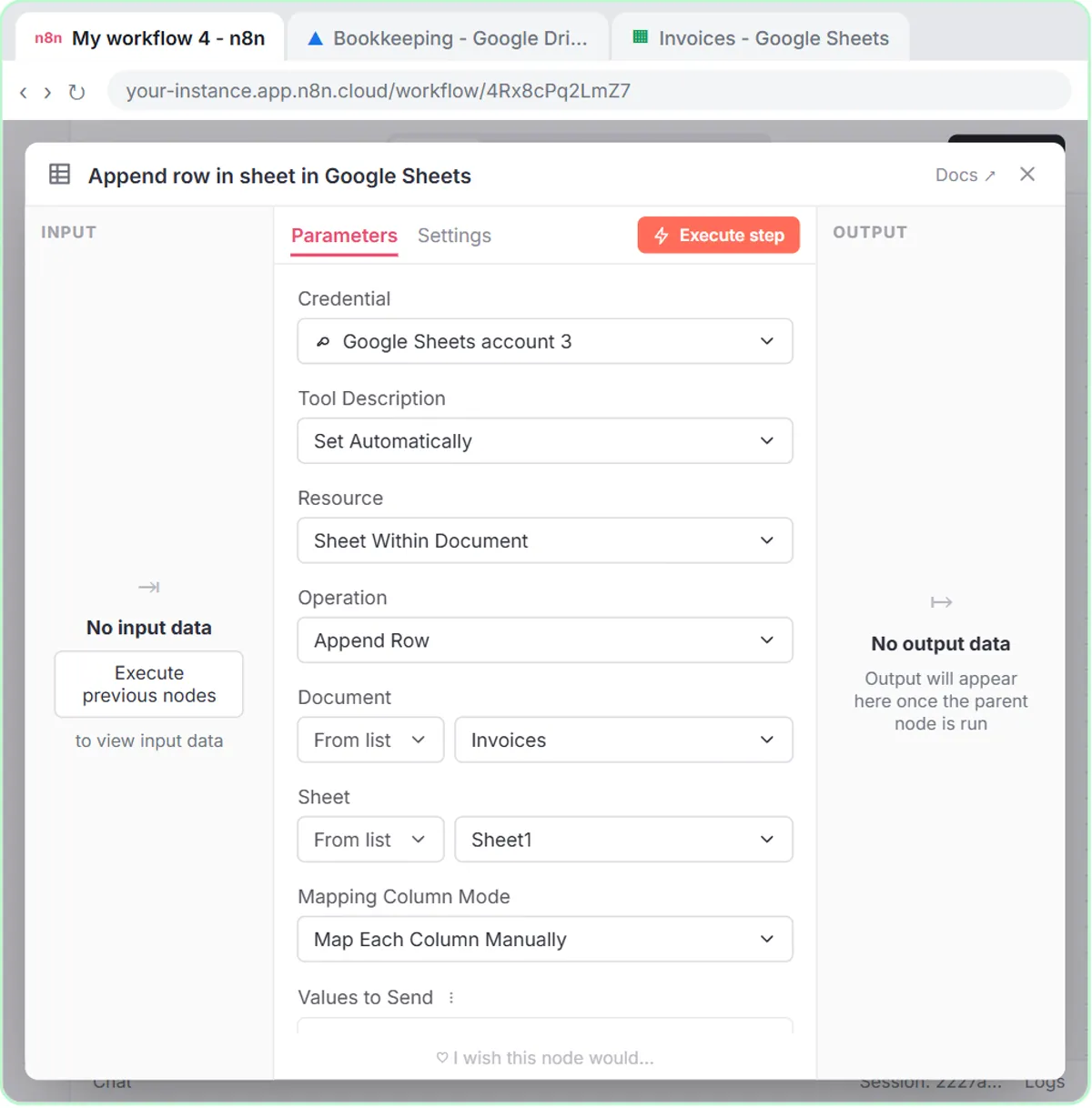
The AI Receipt Extractor lesson builds the kind of sheet a pivot table loves. An n8n agent reads a receipt photo and adds a row to a Google Sheet named Invoices, with four columns: Date, Category, Vendor and Amount. The test receipt becomes a row for groceries at Corner Mart.
The AI Expense Categorizer Agent lesson does something similar for Maple Street Bookkeeping, a made-up firm. Its Expense Log sheet has Date, Vendor, Amount, Category and Note, and the agent must pick from a fixed list such as Office Supplies, Meals or Needs Review.
Neither lesson builds a pivot table. But once those sheets fill up, one pivot table with Category as rows and the sum of Amount as values shows spending by category. The fixed list matters: the finance agent's categories group cleanly, while free-form categories may split into near-duplicates. The spreadsheet formula helper prompt helps when you need a formula instead.
Try this lesson free or read the step-by-step guide.
Common confusions
Pivot table vs filter
A filter hides rows so you see only some of them. A pivot table summarizes rows into totals by group. You can use both, for example filtering a pivot table to one month.
Pivot table vs chart
A pivot table produces numbers in a grid. A chart draws a picture. Many people build a pivot table first, then chart its totals.
Tips
- Keep raw data on its own tab and put the pivot table on a separate one.
- Make categories consistent first, using a fixed list like the finance agent's, so totals do not split.
- Check one total by hand the first time to confirm the pivot table covers the full data range.
Related terms
More Data, Sheets and Gmail terms
Where you use it: free lessons
- AI Receipt Extractor: Receipts to Google Sheets with n8n (n8n, 12 min)
- Build an AI Agent That Categorizes Business Expenses (n8n, 12 min)
- Analyze a Spreadsheet with ChatGPT: Upload a CSV, Get a Chart and Three Takeaways (ChatGPT, 10 min)
- An AI Resume Screener, with a Fairness Step (Recruiting & HR) (n8n, 14 min)
Prompt templates that use it
Frequently asked questions
- Do pivot tables change my original data?
- No. A pivot table reads your data and builds a separate summary. Editing or deleting the pivot table leaves the source rows untouched.
- Can AI build a pivot table for me?
- AI chat tools can tell you which fields to choose, and some spreadsheet assistants can create one. Check the result against a quick manual total before trusting it.